SAROJ GURUNG
UI Designer | Web Developer

HI,
I am Saroj Gurung, and have been working in the product space for over 3 years.
As a meticulous designer, I strive to develop key features such as empathy, observation problem-solving and visualization, which I believe form the foundation of design and align with my interests.
As a code lover, I enjoy crafting clean and efficient solutions exploring ways to bridge the gap between design and development.
Contact
saroj.grg567@gmail.com
https://www.linkedin.com/in/sarojgurung/
Education
Bachelors in Information Technology (Mobile Application)
Academy of Interactive Technology,
Ultimo, 2007
Diploma in Information Technology
University of Technology Sydney: Insearch,
Sydney, 2000
EXPERIENCE
Sole Trader | 2024 – Current
Web Developer
AEMO | 2022 – Current
UI Designer
Prospecta Software | 2022
UI Designer
Technology Rocks | 2021
Web Designer
TOOLS
HTML
CSS
JavaScript
ReactJs
Figma
PHP
Balsamiq
Illustrator
Photoshop
InVision
FRAMEWORKS
WordPress
Bootstrap
Tailwind


Overview
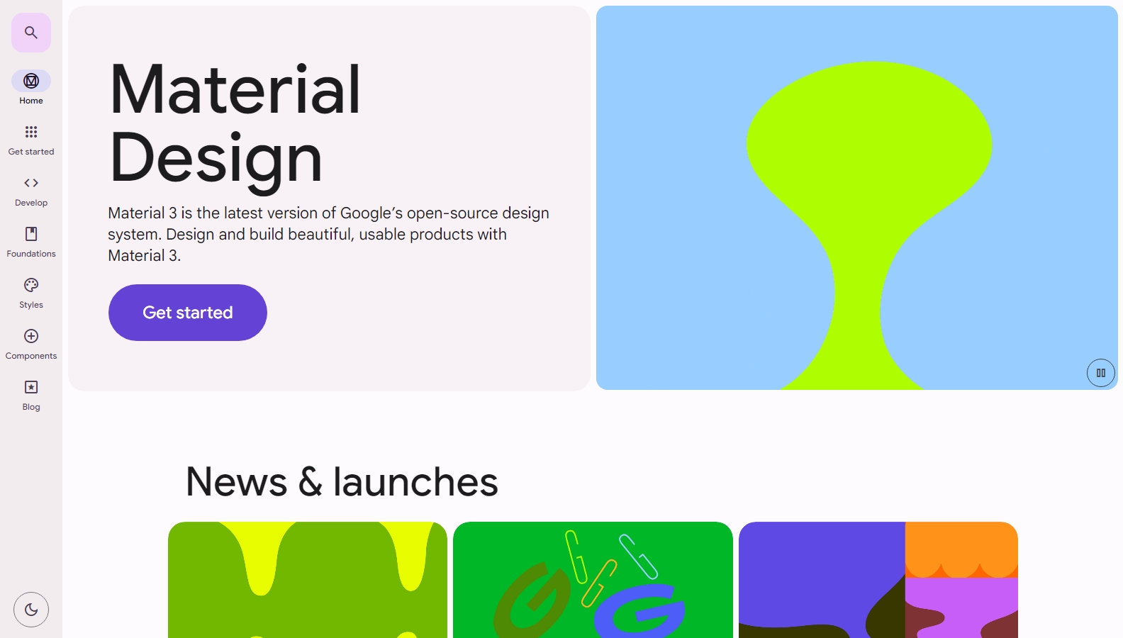
GEL – AEMO DESIGN SYSTEM
AEMO had reached a pivotal point where a design system was needed. It was needed not only for the unified look and feel of the different platforms used in the organization but was needed to create a unified approach to how designers and developers should work together.
My Role
As the core team member in the design team, my main responsibility was to create the UI component library in figma to be consumed by the UX Designer in their feature design. I collaborated with the design lead to ensure that the components created were consistent amongst each other and presented AEMO in every possible way.
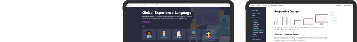
Additionally upon completion of the MVP of the design system, I also helped in exposing the design system to other stakeholders including UX Designers, Developers, Product Managers etc. by creating a documentation website that everyone could easily browse. We achieved this using the open source platform, Docusaurus.
I took the ownership of the components created in Figma which included:
Team credits
Bishakha Shrestha, Senior UX/UI Designer
Sergio Collumbetti, Senior UX/UI Designer
Abhisekh Chuggani, Front-end Developer
Issues
Our Findings
Design Principles

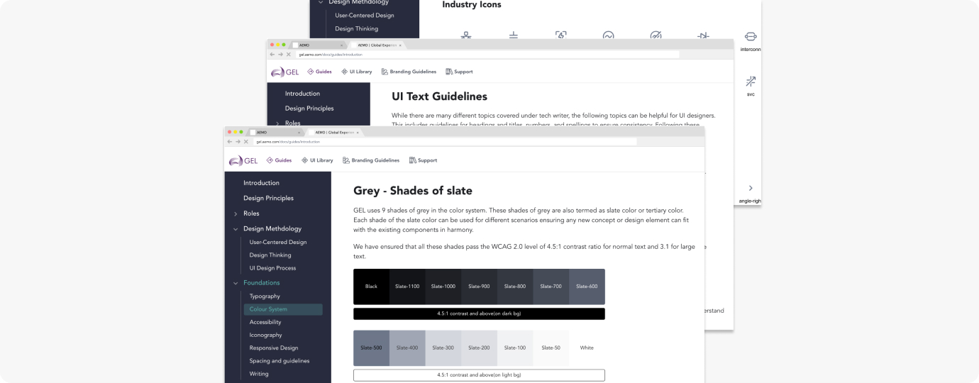
Foundations
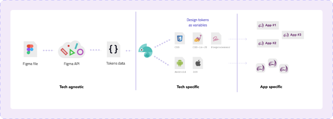
Tokens
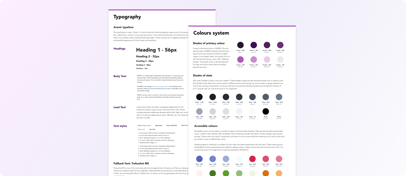
Typography and colour
We cataloged every color by providing its HEX value along with an associated SCSS variable. To adhere to accessibility standards, we precisely defined colors meant for foreground and background usage. Our objective was to achieve a minimum compliance level of 4.5:1 contrast set by WCAG 2.0.
Governance and formalisation
We used Docusaurus framework to create the website which allowed the usage of MDX, and also embed React components as needed.
The tremendous success of the design team’s initiatives to create the GEL website prompted other practices to propose the creation of a digital handbook. This handbook would mirror the principles of AEMO GEL, allowing them to share their standards with their respective communities.
Overview
Prospecta DESIGN SYSTEM
AEMO had reached a pivotal point where a design system was needed. It was needed not only for the unified look and feel of the different platforms used in the organization but was needed to create a unified approach to how designers and developers should work together.
Why a Major Overhaul?
component Analysis and Goals
As a result, I was able to find quite a few components that had unnecessary elements alongside every component that had icons in it. The update required in almost all the components meant creating a updated version of the design system which would solve the following issues:
Updating Components
Documentation
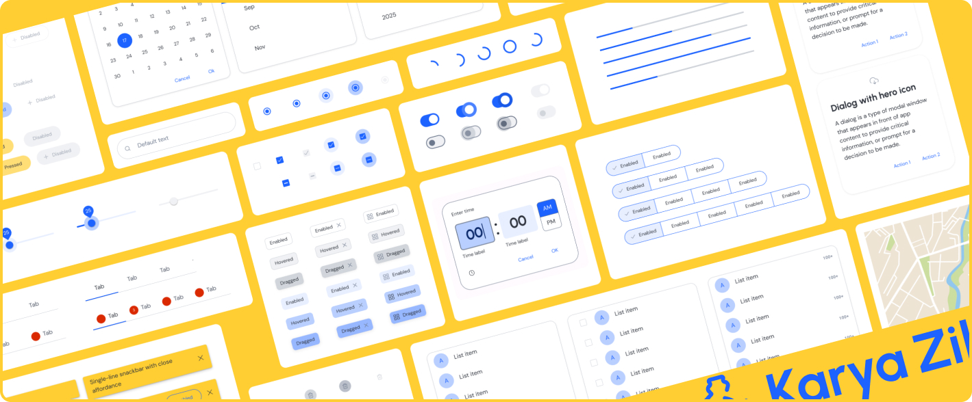
Karya Zilla
The primary goal of the case study was to learn more in depth about how to create design system and how the Material design could be leveraged to do so.
For this I worked together with another design enthusiast and ran a daily workshop to bring our concept into life.
Design System
Logo Design
Feature design


Deliverable
Conclusion
Everest Photography
The design ask was to ensure simplicity and minimalism yet resembling the core of the business.
Requirements from the Client
The logo and watermark template had to be usable across variety of colors.
Factors to Consider
Color: The particular aqua blue used for the logo envokes cool and vibrance. I had to make sure that the color is not too bright nor too dull which gave the logo its elegance.
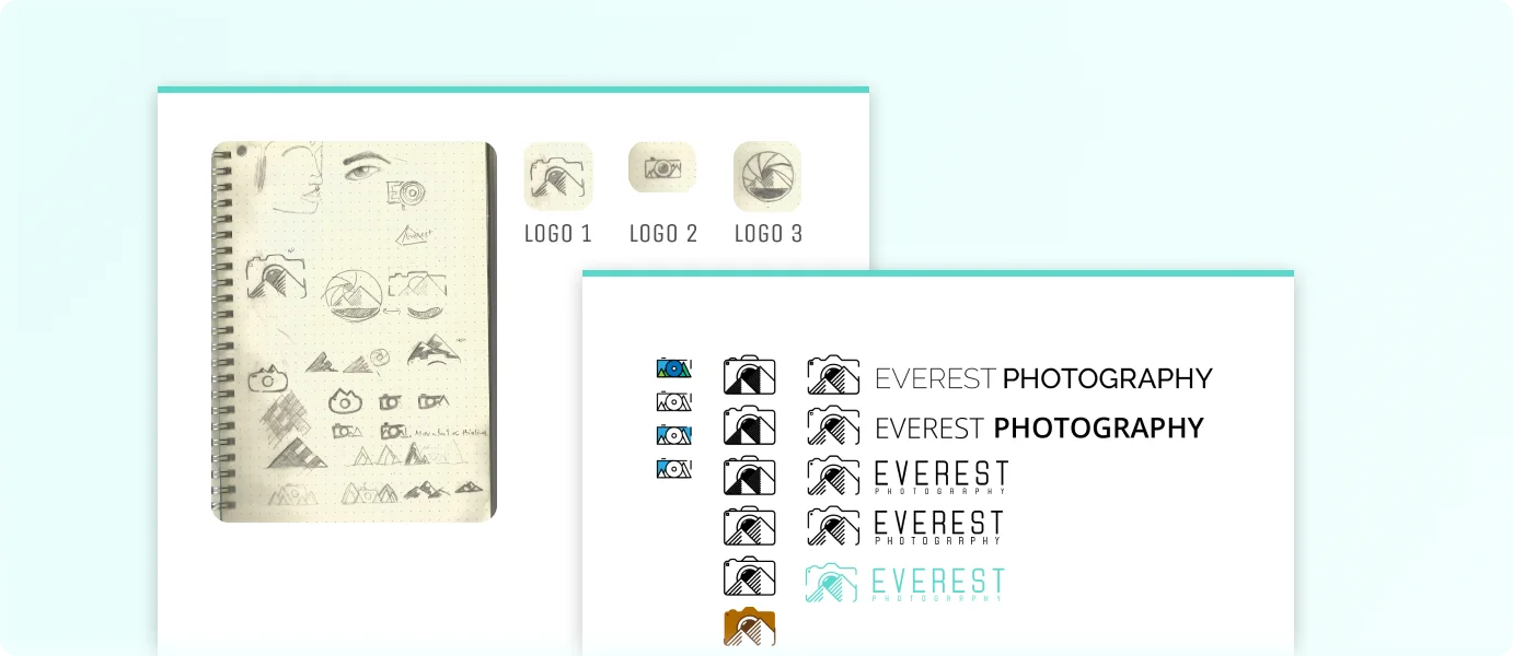
Concept: After many sketches and experimentation, I came down to the concept of using line arts to create the logo. The Nikoleta font was chosen for the fonts to display similar font weight and feel as the camera.
Thinking in pen and paper
On the right, you can see the first stages of my very messy creative process.
Deciding on paper
I provided 3 designs that I thought were best but provided him the option choose from other.
Moodboard
Mr. Prakash approved of Logo 1 and logo 2 as displayed on the right to be viable options and taking that into consideration, I started the design in Adobe illustrator.
BEfore | After

displaying business name for potential clients
Each template would allow Mr. Prakash to watermark the photos and allow him to be contacted by potential clients who are viewing the photos.
The elements in the template should be translucent so the photo is not disturbed by the watermark.

Conclusion
Whilst disappointed to see the logo color a bit too bright and not necessarily fitting into a lot of photos, the option to switch to either white(light) or dark(black) seems to have supplemented the design. Mr. Prakash was delighted about the logo and have been using the three combinations to meet the requirement.
In conclusion, I was able to create the desired logo in the given timeframe and learn more about sizing and color usage for better visibility. It warms myself as a designer to see my work being used by others.